Recent searches
Search options
 @Taffer@mastodon.gamedev.place
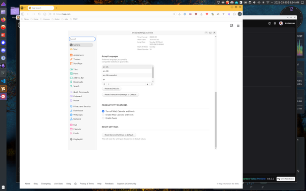
Hey "UX" designers; stop removing UI components that "clutter" the design or "waste space", they're there for a reason.
For example, here's Vivaldi's settings dialog. It's resizable if you grab the ~1 pixel at the edge. WHERE IS THE EDGE?
Remember when we had human interface guidelines, before mobile design made everything worse? Good times.
Setting Vivaldi to "Use Native Window" (which requires a restart) gives the Settings dialog edges again , but the menu doesn't have edges. White on white.
Which is weird, and bad UI, but at least it's not something you need to grab to resize.


